The image above is a rendering of the color & trim work I did for a car interior intended for the United Arab Emirates market. To arrive at this I researched the aesthetics and interior design of UAE and tried to find lighter shades that would not become hot in the sun. I made about 15 different options that I showed the rest of the design team. Then based on their feedback I ended up with what you see in the image above. It has chocolate and taupe shades with rosé champange gold satin finish aluminium trims. The program I used to make this was Fusion 360.
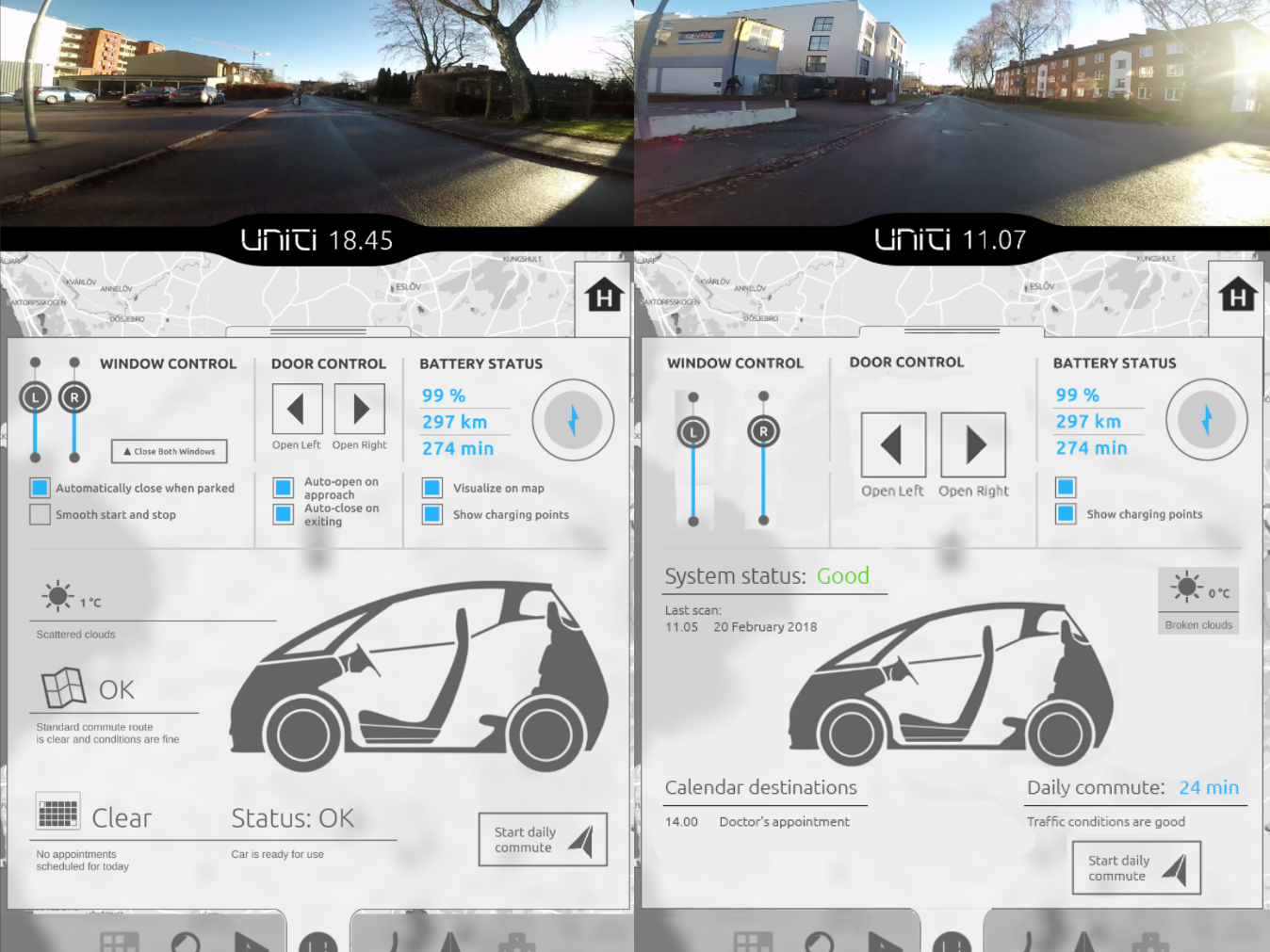
This also shows the screen placements that I was responsible for. I did my research by going over the scientific litterature on screen sizes and placements in regards to gaze travle distance, gaze time and how frequently the driver looked at the screen. I also read studies where the screen placement and size was linked to safety metrics like lane departures, response time and cognitive load. I analyzed the legal documents specifying the screen resolution, size and distance from the driver's eyes for the rear-view camera screen. We made digital human ergonomic models in Fusion 360 to find the sweetspot for the touch screen where the 5th-95th percentile drivers could see the touch screen without having to turn their head and would comfortably be able to reach it.
This image shows one step of the design process that we had in the technical/automotive design team at Uniti. Here, one of the automotive designers have made a sketch of the interior. At this time I have done my research and analyzed the design based on that research. The next step for me is to either discuss it directly with the team or, if I have a lot of comments, I do as I have in the image above and write down my notes, recommendations and sketch over the image. This is good to reference back to in our design process or when discussing design decisions with products owners and other stakeholders.


